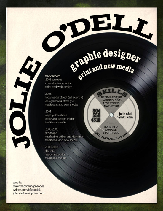
HAND IN date is getting closer and closer... one of the requirements was to make a CV.
So how to start?
1. MAKE IT A SUMMARY
Your résumé needs to tell an employer (at a quick glance) the details most relevant to him or her. This means the whole thing should fit on one page!
2. KEEP IT SIMPLE AND UNDERSTANDABLE
When designing a CV, remember first and foremost that you are a designer, but don’t go overboard. Many people over-design their résumé. It’s a chronic problem: they’ll add so many fancy bits that the actual content gets lost. Most design jobs are all about your ability to organize content, so simplify, simplify, simplify! (But that doesn’t mean boring either.)
3. LEAVE SOME DETAILS OUT
Some people include their entire life history and every personal detail on their résumé. Keep your marital status, age and grades off.
4. MAKE IT PERFECT
You are a professional, so attention to detail is critical. Everything on your CV should line up, every pixel should be absolutely perfect. And even though the job is not to be a writer, a large proportion of employers throw away résumés with spelling or grammatical mistakes in them. By making it perfect, you are showing potential employers that you aren’t sloppy and that you will care about every detail of their projects.
5. MAKE IT PRINTABLE
Most CVs are printed out and given to hiring managers in batches, but not everyone has a photo-quality color printer.
So make sure your résumé
- matches the paper size for your country (letter size for the US and A4 for the UK and Finland, for example), so that employers don’t have to make any adjustments before printing,
- has a white background,
- looks okay in black and white !!!
6. UPDATE IT OFTEN
Résumés are an often neglected aspect of a web designer’s portfolio. Make sure you update it every time you update your portfolio and make it accessible from your portfolio.
7. SHOW YOUR PERSONALITY
You are a designer, so I hope you have your own style. If the job you’re applying for requires a lot of creative thinking, the employer wants to know you’re not a pixel pusher or a drone. Let them know you have personality, a sense of humor and a sense of style ;)


Täähän oli inspiroivaa! Arvostaiskohan ne sairaalallakin tämmöstä CV:tä. :P
ReplyDeleteTottakai! Vähän väriä ja joku mielenkiintoinen asettelu niin Volá! Erottuu joukosta ;)
DeleteThis was really helpful, thank you! :) xx
ReplyDeleteI'm glad to hear! :)
Delete